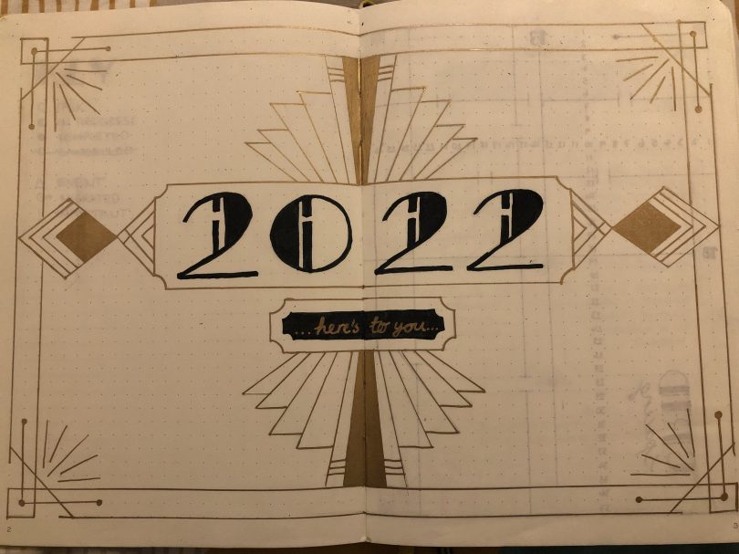
After several requests (from my mum, my gran and my bujo bestie), I’ve bowed to the immense pressure and I’m back with a review of my 2023 bullet journal. I started bullet journalling in 2022 after taking inspiration from my friend Aine from Une Bouchée a Day. Last year, a lot of my monthly themes were based on something that I did during that month or a celebration that was coming up. This year I decided that each theme would start with the same letter as the month. Sometimes I had to stretch it a little bit, especially if I already had something in mind that I wanted to use but it was nice a challenge to get more creative.
January
The January theme came to me quite easily – jigsaws! I kept it in black and white for simplicity, though I made it complicated for myself in other ways. I was really pleased with the variety of layouts that I came up with. My favourite was the weekly spread with the solid background of patterned jigsaw pieces. It took a long time to fill in but it’s the kind of work and drawing that I really enjoy, quite repetitive and monotonous.


February
For February I chose the theme of fruits, particularly citrus fruits like lemon, lime, grapefruit and orange. I like the block style of a lot of these, although they took a long time to draw and colour in. I also think the slices for the mood tracker are really cute!


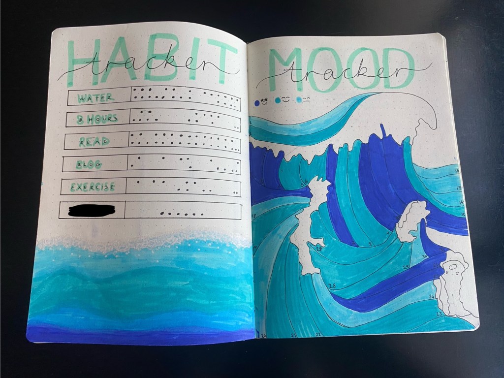
March
March = marine. The colours on this are some of my favourites, all the different shades of blue and then the black fine line drawings of whale tails, jellyfish, coral, starfish and shells. This one got the thumbs up from my marine biologist sister so what more could I ask for!


April
I think this month was one of my favourites of the year. The theme was technically abstract but I specifically wanted to do it in the style of Piet Mondrian, an early 20th century Dutch artist. This was actually inspired by a trip to a wine bar in Mulhouse, where I was living at the time, with my friends Àine and Sam, that was also themed after the artist. In general, I like my themes to have limited colour schemes and I think the red, blue, yellow and black were really effective. It was also really fun to play with the spacing more on some of the spreads.


May
Now this. THIS. This is potentially one of my favourite things I have ever or will ever create. I’m so proud of this one and so incredibly pleased with how it turned out. I’ve had this theme in my head since I started bullet journalling and I finally used the month of May and the theme of mosaics to do it. This design is based on the palau de la música catalana in Barcelona. I first saw this place on a trip with my mum and sisters in 2018 and we all loved it. A few years later, my sister got a calendar from Hebe Studio that had painted versions of beautiful places around the world in it, including the palau. I cut out the print of it after the year was over and started using it as a poster on my wall and that is what I copied from for this month’s spread.


I held back from doing this in March, which also would have fit with the mosaic theme, and instead did this in May because at this point, I was still living in France but had finished my job there. This meant that I had a lot of down time that I could spend on this and it needed it! I know I just said that I like a limited colour scheme but that’s mostly for convenience, so I don’t have to carry around a lot of different coloured pens. I also love the maximalist design aesthetic and this definitely leaned much more into that! It took a long time to initially pick out the colours for each pillar for the cover page but it was a little easier for the rest of the month after I knew what I was doing. I think I actually managed to get the mosaic tiling to look pretty close just using my felt tips pens.


June
After the mammoth effort the month before, my most important criteria for June was that it be simple. I went for the theme of jewels, although I think that it ended up being a little more like crystals. It’s not my favourite thing I’ve ever done but it served a purpose and I really like the font that I ended up using.


Summer
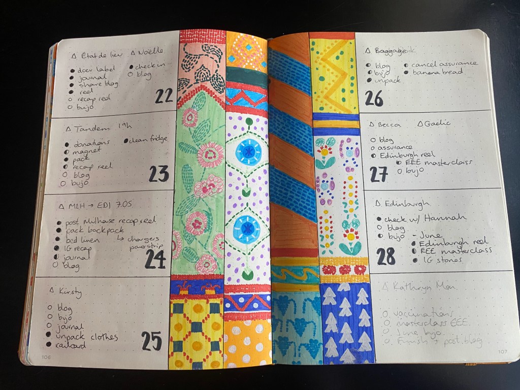
I was travelling for a lot of the summer, throughout most of July, August and September, and I knew that I wouldn’t be needing my bullet journal as much as usual. I wanted to keep the theme simple so that I could take just a few pens with me and so that I wouldn’t be spending lots of time doing it. I went for a compass motif, roughly based on the necklace that I’ve been wearing since I was 18. I also made sure that I prepared all of the, albeit more limited spreads, that I would need while away ahead of time. One thing that I did want to do while I was away was a little drawing a day to keep track of the highlights of the trip. This was something that I did when I was travelling around Central America in 2016 and I love looking back on it. I enjoyed doing it again this time, although I did end up having to go back and finish it after the trip.


October
October was the first month after I moved to Costa Rica and I wanted something that reflected that as well as sticking to a theme that started with ‘O’. I think that in the end I went with outdoors as a theme, leaning towards tropical. You can see that throughout the year I’ve stretched the idea of having a theme starting with the same letter as the month to fit with the ideas that I had already but it’s my bullet journal and I’ll do what I want!


November
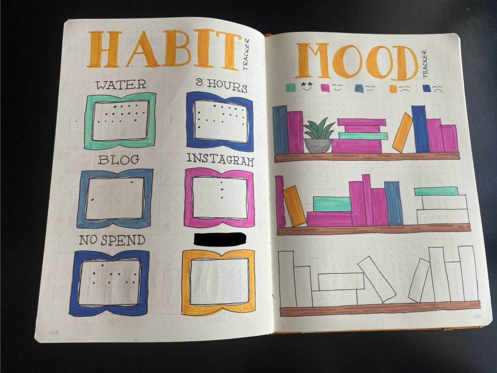
November rolled around and I really struggled to pick a theme. There wasn’t a lot coming to mind that started with ‘N’ that I thought would look good or that I would be able to do well. In the end I settled on novels, basically books, and I think that it worked out! Anyone that knows me knows that I love reading and being around books is very relaxing. I feel like I got the same feeling from drawing out these spreads!


I have to say, however, that by November, I was a bit tired of doing my bullet journal. Already in October I hadn’t used it as much, finding that it wasn’t as necessary in my new job. I was also finding myself resenting the time that it took to set everything up and prepare each spread, because it really does take quite a lot of time. All the time that I spent on my bullet journal in November, I was wishing that I could be doing something else, mostly blogging! I had already been thinking about stopping at the end of the year but it got to the point that I didn’t want to be doing it anymore so I stopped. I’m a little disappointed that I don’t have anything to show for December but it wasn’t serving me anymore.
So surprise! At least for now, this will be my last post about bullet journalling. I’ve enjoyed doing it for the past two years and I don’t regret the time that I’ve spent on it but for now, I’m moving on. Maybe one day I’ll come back to it, who knows?